CSS Customization
You can use CSS to customize the appearance of almost anything on your Client's Scheduling Page. Styles can be added under Advanced CSS.
CSS Code ExamplesCheck out some helpful CSS snippets you can use to further customize your scheduling page here!
1. Appointment Type/Calendar Selectors

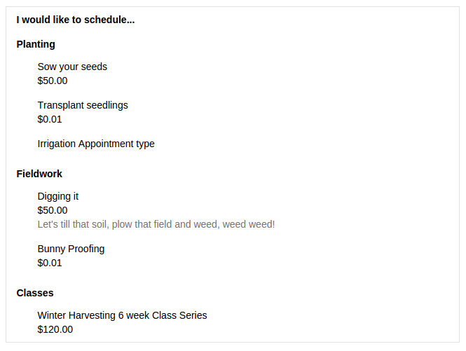
There are two select groups like in the screenshot above, one for selecting which appointment type to book and an optional one to select a calendar. If you would like to style a particular select, these are the parent selectors:
.select-type Appointment type selection
.select-calendar Calendar selection
Within each select, these are the main classes that can be styled:
.select-item A clickable item in the list (ex. "Sow your seeds")
.select-label The name of a category, not clickable (ex. "Fieldwork")
.duration-container The container surrounding the price and duration for the appointment type
.type-description This is the longer description of an appointment, like what is below "Digging it"
To style a particular appointment type inside of the list use the id for that type. This can be found using the inspector in your browser's developer tools. For example, this selector can be used to style the name of one appointment type in that list:
.select-item[for="appointmentType-231769"]
2. Calendar Selectors
These are some of the basic classes you can use in your styles to customize the calendar appearance:

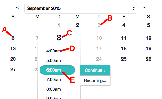
A) .scheduleday.activeday This is a clickable day on the calendar which has appointments available.
B) .scheduleday This is a day without appointments available and is not clickable
C) .choose-time-container h1 This is the date after clicking on it
D) .choose-time-container .time-selection+label This is a clickable time that can be scheduled
E) .choose-time-container .time-selection:checked+label After clicking a time to schedule this is the style of it
3. Standalone Scheduling Page Selectors
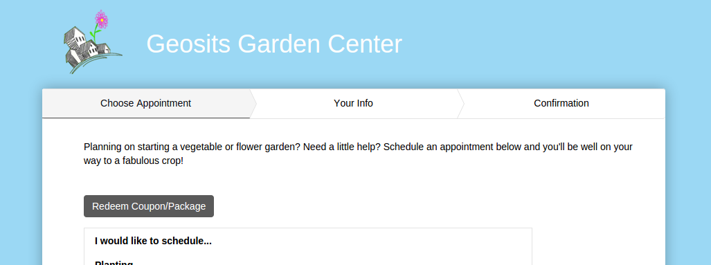
Your standalone scheduling page, like https://geositsgardencenter.acuityscheduling.com/, will have a logo, business name, and background on the page. When the scheduler is embedded into your website only the main scheduler content will be shown.

.business-container The container surrounding both the logo and the business name
.business-logo This is the logo image
.business-name The name of the business
body This is the main body which currently has a body background color set. This color can be changed under Appearance, or you can use CSS to style and add a background image.
4. Embedded Scheduling Page Selectors
When embedded, your scheduling page behaves slightly differently. The space around the scheduler is removed, and .business-container, .business-logo and .business-name are all hidden.
To help with styling embedded schedulers, we add a the selector .is-embedded to the body.
5. Intake Form Selectors
Intake forms also come with their own selectors. Individual fields and the form itself can be styled. These selectors include the ID for that element which you can look that up right in your browser, using the browsers inspector. Usually this is done by simply right clicking on the form input, and selecting to "Inspect Element".
[data-field-id="351472"]This is the entire input and label[data-form-id="351472"]This is an entire form
One useful option for passing between your system and ours is to combine custom field CSS with a custom embedding query string. This allows you to set a field's value (ie. "Customer ID"), then hide the field from the client.
Updated 11 months ago
