CSS Customization
Advanced CSS allows you to customize the appearance of your Client Scheduling Page with supported selectors. Use selectors to target individual components on your scheduler, to give you more control over the look and design of those fields using CSS.
Add your CSS styling on the Advanced CSS page.
Custom CSS on the updated Client Scheduling Page
Acuity is releasing a new scheduling experience, which provides a refreshed look and faster loading times. As part of this update, we’re overhauling our Advanced CSS feature.
On the previous booking experience, you could use CSS to modify almost all fields on the Client Scheduling Page. Designating supported selectors helps us prioritize consistent behavior and avoid broken customizations during platform updates.
To preview how your custom CSS will look on the updated scheduler, click Preview Changes in the Advanced CSS page.
Business Information Selectors
You can also use CSS to adjust your business name or logo and your scheduling instructions, if they’re displayed. Learn when Acuity will display your business name or logo.
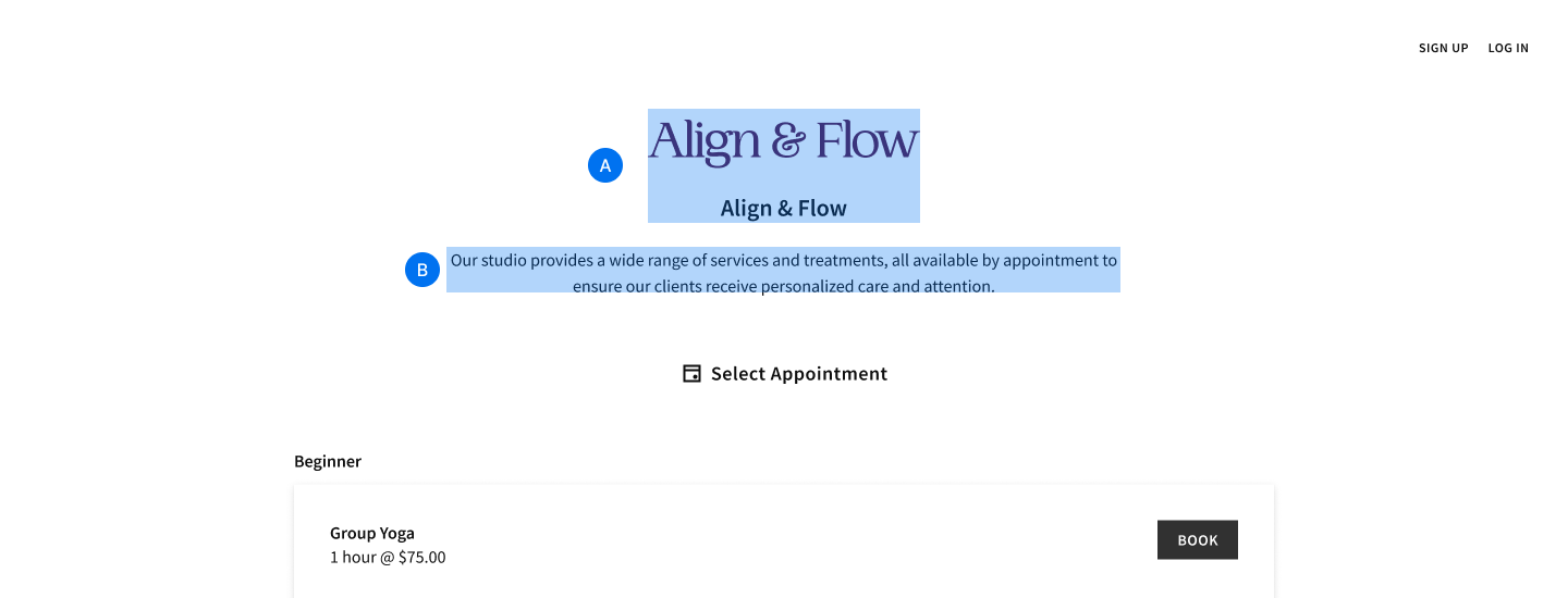
A. .business-container: Selects both the business name and logo, if both are displayed.
B. .business-description-container: Selects scheduling instructions, if available.

A. .business-logo: Selects just the business logo.
B. .business-name: Selects just the business name.
Appointment Type Selectors
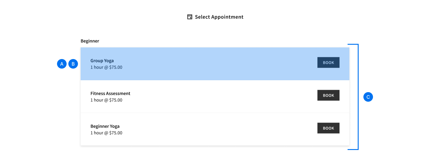
A. .select-item: Selects the container surrounding each appointment type, calendar, category, and product.
B. .select-item-box: Selects the container surrounding appointment types, and calendars. It does not apply to categories, and would override .select-item if both were active.
C. .select-type: Selects the entire container for all appointment types. If Collapse Categories is enabled, this includes the category name

A. .appointment-type-name: Selects the appointment type name, category name, or product name. Excludes any buttons or padding.
B. .duration-container: Selects the duration and price, if available. Applies for both appointments and items like packages, gift certificates, and subscriptions.
C. .type-description: Selects only the description for appointments and store items.
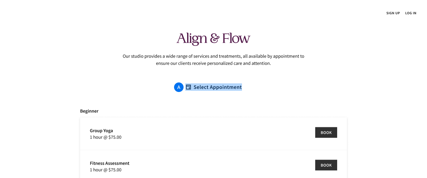
A. .step-title: Selects the title of each screen in the scheduler, for example, “Select Appointment”, “Select Calendar”, “Date & Time”, etc.
Calendar Selectors
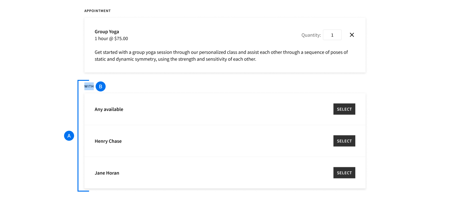
A. .select-calendar: Selects the entire container for all available calendars.
B. .select-label: Selects the labels above any block of selectable items, such as categories, appointment types, calendars, store item categories, etc.
Date & Time Selectors
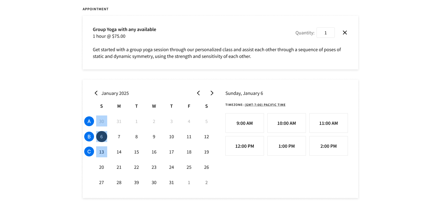
A. .scheduleday: Selects all days on the calendar when using the Monthly Client Scheduling Page template.
B. .scheduleday.selectedday: Selects the day that the client has clicked on.
C. .scheduleday.activeday: Selects days with appointments available when using the Monthly Client Scheduling Page template.
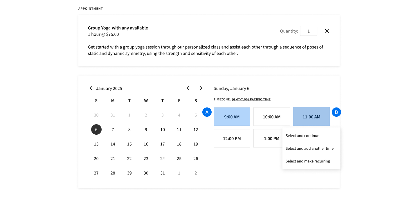
A. .time-selection: Selects all available time slots.
B. .time-selection.selected-time: Targets the selected time slot only.
Add-on Selectors
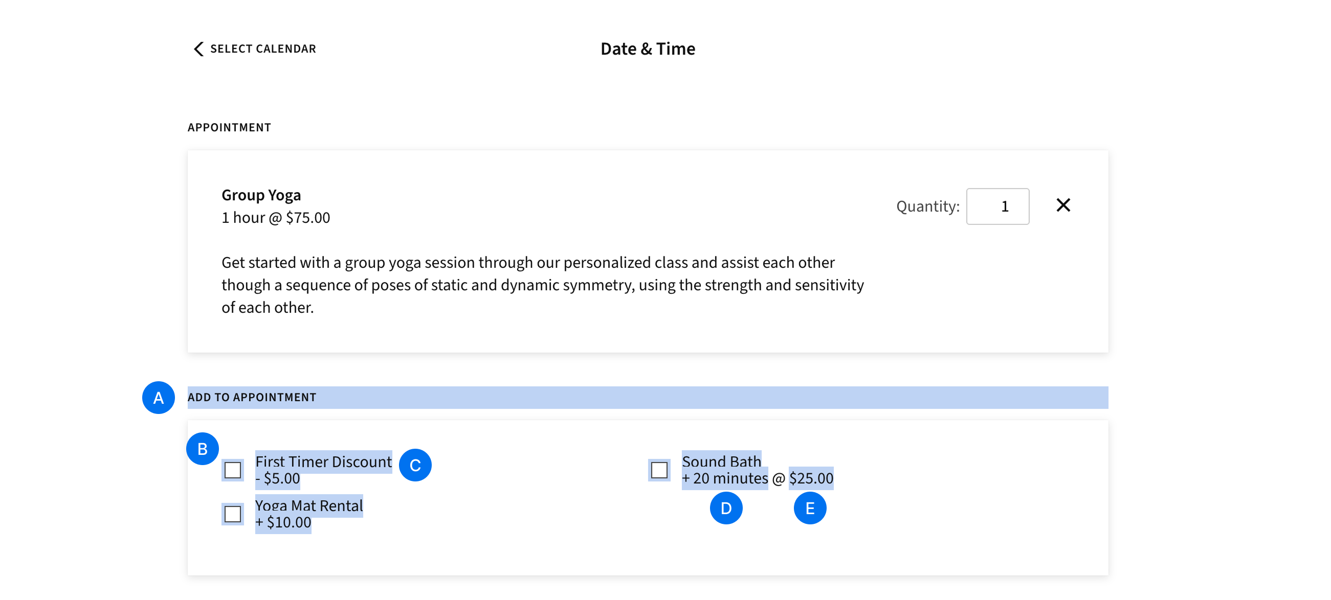
A. .addons-prompt: Selects the label above the add-ons container. This says "Add to appointment" for appointments or "Add to class" for classes.
B. .addon-option: Selects the add-on checkboxes
C. .addon-name: Selects the add-on label
D. .addon-duration: Selects the duration piece of the add-on duration and time label
E. .addon-price: Selects the price piece of the add-on duration and time label
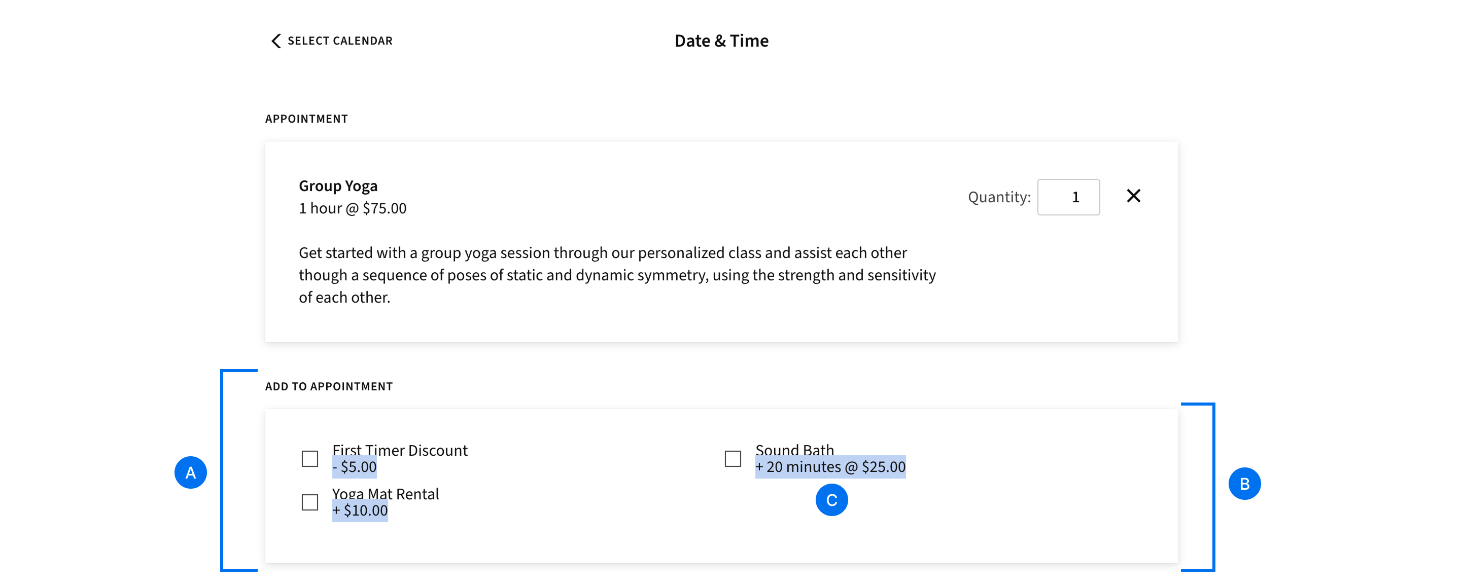
A. .addons-container: Selects the entire add-ons container including the prompt at the top
B. .addons-list: Selects only the add-ons container without the prompt
C. .addon-attributes: Selects the entire duration and time label for add-ons (as opposed to only the duration or price like .addon-duration and .addon-price above).
Intake Form Selectors
Intake forms also come with their own selectors. During booking, you can display multiple forms, each made up of multiple fields. You can style individual fields and each form itself. Form and field selectors include a unique ID for the element you’re selecting. You can look up each element’s ID using your browser’s inspector tool. Usually this is done by right-clicking on the form input, and selecting "Inspect Element".
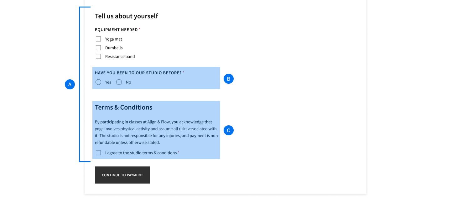
A. .custom-form: Targets all intake forms.
B. [data-field-id="123456"]: Selects a specific intake form field and its label.
C. [data-form-id=”123456”]: Selects an entire intake form.
Note: When using data-field-id and data-form-id selectors, you must replace the example ID "123456" with the unique ID for the element you’re selecting.
Additional Customizations
@font-face: Loads a font from a remote source, which can then be used in the scheduling page..btn: Targets all primary buttons on the scheduler..is-embedded: Make customizations that only apply when your scheduler is embedded in a website. A selector named.is-embeddedis automatically added to the body of your scheduler when it is embedded. For example, combining the.is-embeddedselector with.type-descriptionmodifies the descriptions of appointments and store items on your embedded scheduler only.
Updated 11 months ago
